According to recent data, every 1000 visitors to a non-profit website yield $612 in donations. Knowing that these websites need to continually engage an audience of donors, here are five things to keep in mind as a charitable online presence is being created.
1. Make it easy to follow
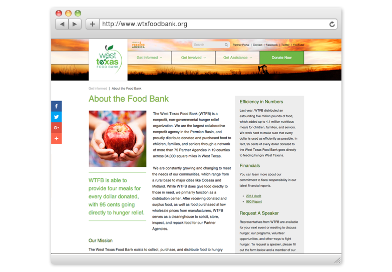
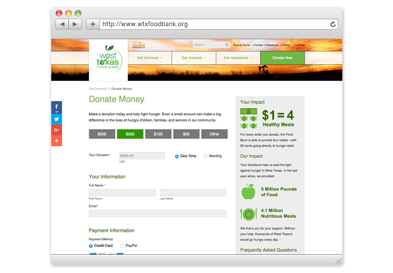
It’s tempting to fill your website with information but, considering you have about 8 seconds to capture first-time visitors’ attention, this can overwhelm them and make them click away. Instead, create a hierarchy to your content that helps direct the user’s eye down the page and to the information that you want them to see. For example, the West Texas Food Bank website includes an image at the top, a simple menu, a breadcrumb trail in the navigation which tells users what page they are on, and a large title for the page, all incorporating an easy-to-read font.
Additionally, graphics should not get in the way of important information. For example, potential donors shouldn’t have to sort through a large number of photos on an event page to find information on how to attend the event.
2. Use feature images to promote participation
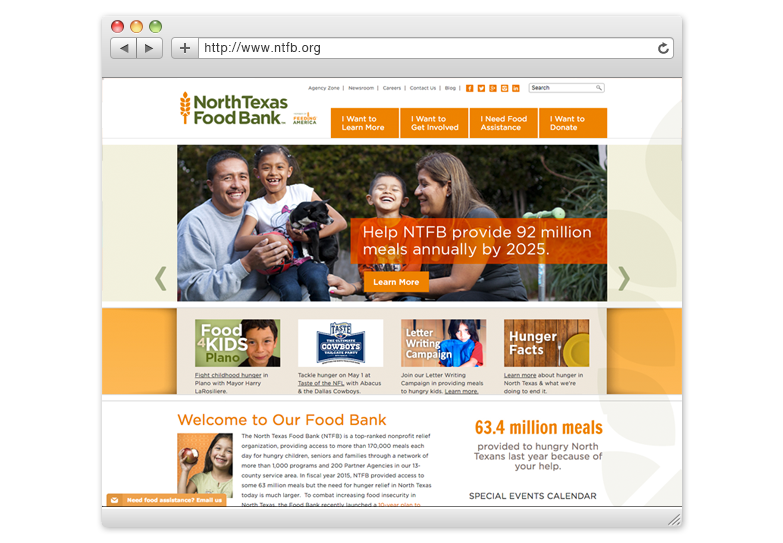
While there are several ways to do this, the approach used for the North Texas Food Bank is a good example of a simple strategy. It includes two levels of information on the homepage. First, the larger feature images cover three different topics: volunteering, senior hunger, and family hunger. Secondly, a row of smaller callouts, located below the larger images, allow the food bank to showcase local events which are updated regularly.
3. Plan for a mobile version of your site
Put some thought into what you want your mobile audience to see. For example, the North Texas Food Bank decided to include the volunteer page, the donate page, and a few other key pages. This has worked well for the organization, as their mobile website traffic has grown almost 9% over the past year. It also helped support donations on-the-go during their holiday campaign, which included eight billboards in the Dallas area. On the other hand, the West Texas Food Bank chose a responsive design, which simply resizes the information from a desktop version of the site to create the mobile version.
4. Don’t take the donation form for granted
First, consider including donation buttons promoting specific amounts at the top of the form to encourage larger donations and guide the donor towards a decision. You may also want to include different ways to donate such as donating in honor of someone else. Finally, simplify the form to include only the information needed to process the donation and to gather contact information.
5. Incorporate “donate” into the main navigation
This may seem like an obvious strategy but there are numerous non-profits which include their donation links within sub-menus. Featuring them in the main navigation allows the donation message to appear on every page of the site. This may require reorganizing or simplifying the navigation but it may also lead to a more streamlined and more inviting online presence.
With charitable giving in the U.S. expected to grow by 4.9% in 2016, a good strategy for an online presence can go a long way.